Responsive website design (also sometimes called adaptive web design) refers to websites created within a flexible grid. The reason for designing a website in this way is so that no matter what resolution, window size or device someone is using to view it, it should appear and function properly for them. If done correctly, using Cascading Style Sheets 3 (CSS3) Media Queries and HTML5, the site design should reorient and resize itself to fit a browser or device automatically.
If you have tried browsing the web on a smartphone then you know that currently most websites are slow to load, hard to see, and don’t function well on them. Smartphones will outnumber PCs before the end of 2012 and tablet PCs continue to increase in popularity. Websites will need to adapt to these changing conditions or they will soon find themselves a thing of the past.
For a FREE WEBSITE DESIGN CONSULTATION, Contact Active Web Group TODAY!

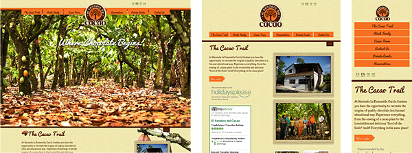
There are two ways to tackle a responsive design. The first, and most widely used right now, are stepped, non-flexible grids that simply display themselves at certain pixel dimension thresholds. For example, on the site pictured above anything 750 pixels or wider will use one layout and anything below 750 pixels will use another. If you’re using a device that you can resize your browser window in then click the image above and resize the browser to see it in action.
With just two layouts and CSS3 Media Queries, this is relatively simple to implement. The way this particular site displays on my tablet still has something to be desired. But, this type of responsive design is so easy and relatively inexpensive to implement (based on the size and current layout of your site of course) that I can’t see a reason not to look into reworking your site so that it functions similar to it.

The second way provides more of a custom layout, no matter the size of your browser. This type of responsive design also creates smooth transitions on the fly when the browser size is changed (or your mobile device is turned). For me personally, I think this type creates a better overall experience. You do give up some control of the layout, but knowing how incredibly important your website is for branding your business, I would take the extra time and effort to lay my website out in this way.
How it is done is by using primarily percentages instead of fixed pixel widths on images, tables, positioning, etc. It still uses CSS3 Media Queries for the layout transitions, but all of the resizing is done primarily with simple percentages in your html and style sheets.
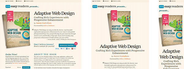
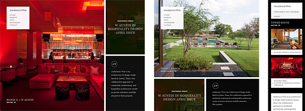
More responsive web design examples:
Those are the basics of adaptive/responsive design. For more information contact Active Web Group today and let us show you how we can enhance your online presence with your own responsive website design.
