Mobile phone technology has improved tenfold over the last decade. We keep our personal devices on or within reach of us at all times. There are countless ways our devices aid us in our everyday tasks; using them is second nature.
Research shows that nearly half of all smartphone users interact with their device single-handedly. When cell phones first emerged, learning how to use one was similar to a way a toddler figures out how to use a cup: with both hands & full focus. Over time, these actions require minimal concentration to operate.
As designers, we would like to believe that users interacting with our work are providing their full attention, but we cannot deny the fact that they might be using their device passively. Whether our user is using their phone while simultaneously pushing a shopping cart, working out, or commuting via a crowded subway – we must design to assist their behaviors.
Is your website mobile friendly?
One Size Does Not Fit All!
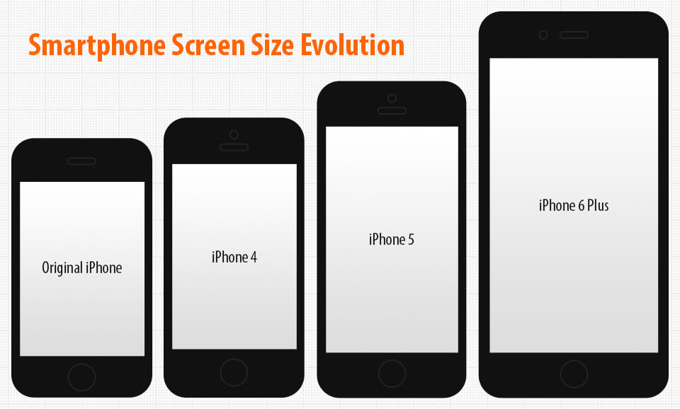
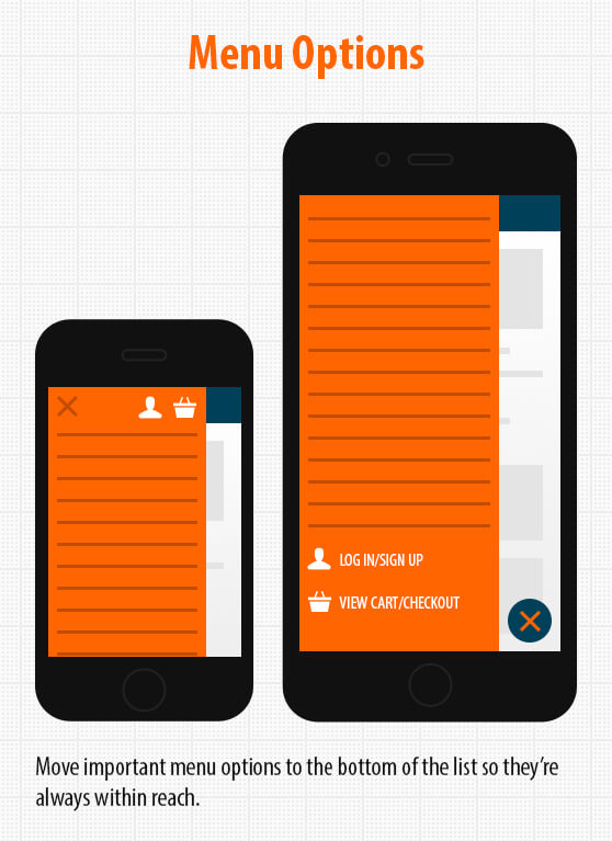
Every designer’s goal is to not only to create work that is aesthetically pleasing, but easy to use. Bigger screens foster new opportunities as well as challenges. One of the more glaring restrictions on large smartphones is reach. For single-handed users, the top of the screen is difficult to extend to with a thumb. Important calls to action that are typically found within website headers such as menus, telephone numbers, and shopping carts are not as easy to tap on large screens. These subtle details seem trivial, but continual strain can impact user experience and conversions.
Apple has addressed this issue by introducing a feature called Reachability on the latest generation of iPhones. Double touching the Home button on the iPhone 6 & iPhone 6 Plus will slide the entire viewport down for better reach.
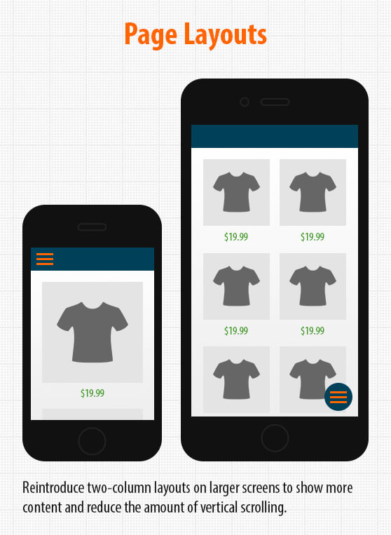
Illustrated below are a few ways web designers are modifying mobile websites to accommodate single-handed smartphone users (click illustrations to enlarge):
 |
 |
 |
As technology evolves, we must continually re-evaluate the way it’s being used. Smartphone screen sizes are getting bigger with each release, and it is our job as web designers to maintain a comfortable user experience.
