Conversion Rate Optimization, also known as CRO, is crucial element of any website, yet often it is half-hearted or completely forgotten altogether. According to Venture Beat, “[CRO is] the marketing equivalent of the smart salesperson that spends 80% of his or her time working on existing customers, rather than the colleague that chases across the country trying to find all new business.” This can be especially true with landing pages.
With landing pages, a lot of marketing resources will be thrown at the medium that drives traffic to the website, whether it is an email campaign or PPC keywords, etc. When it comes time to develop the landing page, many businesses will feel as though the hardest part is over.
While the traffic medium’s messaging is important, it is also vital to make sure that users continue to feel compelled to engage with your site – i.e., the lights are on and you are welcoming your guests to come inside and enjoy the party.
Here are our landing page tips so that your users don’t feel left out in the cold:
Mobile Optimization
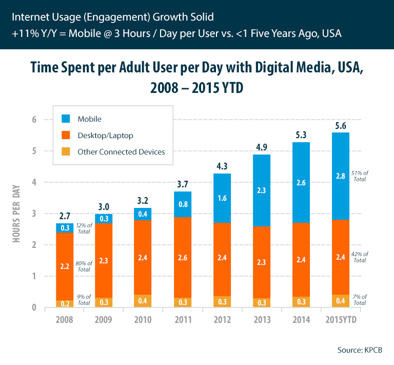
There’s no more denying it – mobile is how users are acquiring their information, and there is no turning back. According to the latest KPCB mobile technology trends by Mary Meeker, users are spending more time on their mobile devices than desktops and other connected devices.
If a user is unable to comfortably view your site on their smartphone, it will be difficult for them interact with your landing page. In the age of mobile rule, users are drawn to ease of use and convenience, so not only is a mobile-responsive design important; but so are other site elements, such as page load time.
Clear, Valuable Messaging
If a user has made it to your landing page, it is clear that they are at least mildly interested in what your business is offering. Don’t lose them by over complicating things. Be sure your message is clear, to-the-point, and in-line with the user’s original expectations. This will allow users to keep their focus and stay in-line with the original reason for their visit.
How does this happen? It all starts with the headline. This will likely be the first thing users notice upon arrival, so be sure that it is clear and consistent with the messaging that drove the traffic to the page in the first place. If you are offering a free trial of a service, don’t begin the page with a company overview. Users need a seamless experience, and even small hints of additional searching could cause them to bounce from the page.
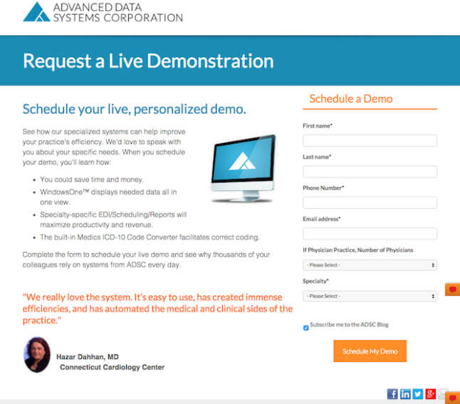
For example, HubSpot recently highlighted this landing page from Advanced Data Systems Corporation to highlight how the headline and sub-headline clearly state the available offer. While the additional information is on the page for users who are interested, the headline makes it clear for users straightaway what the offer is and how to do so.
Call To Action
If a user has made it to your call-to-action button, surely they are ready to convert, right? Not necessarily. It is like saying that our party guests from earlier are definitely going to have a good time at the party just because the day before they thought they were going to have a good time. Such as with landing pages – the call-to-action is the final prompt for a conversion, yet 70% of businesses do not have call-to-action buttons according to TruConversion.
A call-to-action button is arguably the most valuable item on your landing page. It needs to have the ideal design and proper placement to encourage conversion, as well as fulfill on the promise made in your headline and subsequent copy. Choosing a color that draws attention yet also ties in with your branding/page message is ideal along with making sure it does not get lost below the fold of the site.
When it comes to messaging, it is best to consider “submit” a dead term. While it is clear that the form will indeed be submitted, it provides no excitement to the process – and no, adding an exclamation point isn’t the answer.
A fun and productive idea from CopyHackers’ Joanna Wiebe is to write button copy in the first person. Ultimately, your call-to-action button should answer the question:
I want to ________________
It’s clear that no one actually wants to submit or register, but they do want to “start a free trial” or “see results.”
A/B Testing
Just because a landing page follows best practices doesn’t mean it is going to convert the way that you expect it to. While initial designs and strategy are important, landing pages are often a work in progress and subsequently need A/B testing.
As an ongoing task for your landing page, monitor your audience behavior and page analytics to get a full understanding of your visitor’s choices. Armed with this information, you can begin testing various aspects of the landing page to see if there is a change in conversions. Be even more mindful to A/B test when you hear of new user trends and behaviors, as these could be why good performing pages are showing decreases in conversions.
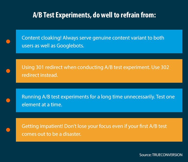
During an A/B test, be sure to refrain from the following so that your test is aligned with best practices:
Ultimately, it is important to give your landing page the tools it needs to create user conversions. By keeping user experience at the forefront of strategy and planning, your business will be on its way to a stronger conversion rate. It is also important to remember that complacency kills conversions, so keep testing – just because you always serve your guests spinach dip doesn’t mean they wouldn’t love to try mini tacos – and the same goes for landing pages: never settle!
If you are looking to optimize your site’s conversion rates, let the team at Active Web Group help. Our CRO team will create a cohesive campaign and will deliver the results that you need. Call us today at 800-978-3417 or click here to get started.


