Welcome to the latest installment of Web Design Trends! At the time of writing this (early 2013), Google Chrome is the only commonly used browser that supports the vast majority of new HTML5 features. If you are not viewing this page in Chrome, I highly suggest that you download it so you can fully experience all of the features I will be describing in this article. Alternately, you can use this link to run Github’s HTML5 test to check your browser’s compatibility.
1. HTML5 Web Design Interactivity
On December 17th, 2012 the World Wide Web Consortium (W3C) announced that HTML5 is now a feature complete Candidate Recommendation. I predicted two years ago that HTML5 would become a trend (and it did to some extent) but it was so early in its development that it is clear now I was projecting too far ahead. Now that it is feature complete, W3C will most likely adopt it as a standard in the next year or so. Browsers are currently rushing to make themselves compatible. I predict that 2013 will truly be the year that HTML5 dominates, especially in the area of interactivity.
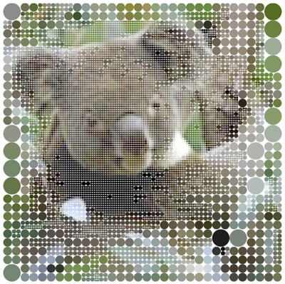
In the example up top, Chris Milk created an interactive movie with a fully animated homepage that you can also hover your mouse over to “steer” around through the clouds. It is amazingly smooth, even on low-end machines and takes only seconds to start up on a broadband connection. In the example directly above, Vadim Ogievetsky created “Koalas to the Max”, another great example of graphical interactivity that takes pointillism to a new extreme. Click on an image to see that site in action.
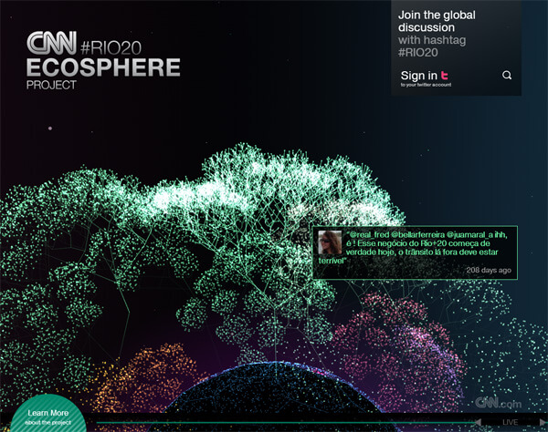
Rich content can now be embedded into HTML5. High quality vector graphics (a la Flash), animation, video, audio and social media interactions are integrated, so expect seamless design and tons of interactivity on websites this year. CNN’s Ecosphere is a great example of an interactive website that is fully integrated with Twitter. Sites are already becoming a lot less static and this is a trend that will surely continue well into 2013 and beyond.
2. Interactive Scrolling
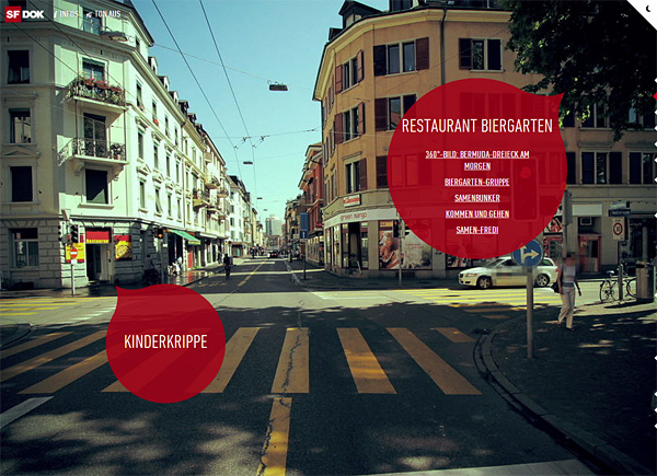
While parallax scrolling is nothing new, some sites have developed entirely new ways of navigating via the scroll bar. As opposed to the standard up and down we have come to expect, these websites use Javascript, CSS3 and/or HTML5 to create a more immersive and interactive experience. In the example above (which you will need Chrome to view as of writing this), the scroll bar allows you to take an interactive tour through main street in Zurich.
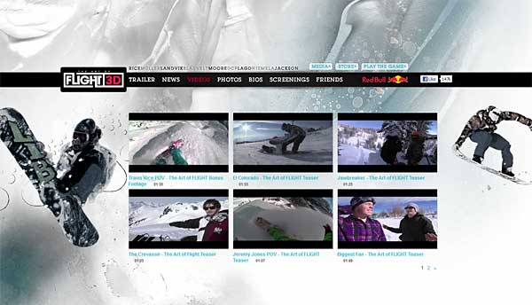
“The Art of Flight” takes scrolling to a whole new level with a parallax type Javascript scrolling technique that literally spins you (and everyone else) around the site like a snowboarder doing tricks. Click the image above and start scrolling to see it in action.
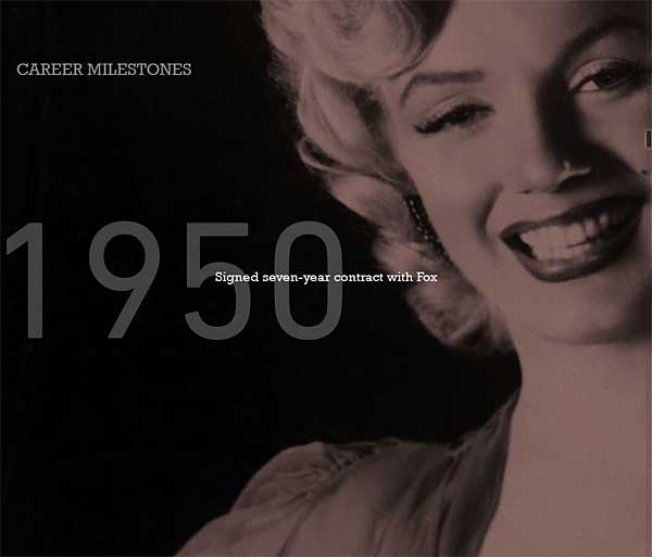
Ironically enough, Turner Classic Movies created this cutting-edge HTML5 scroller to highlight stars from the golden age of movies. Each star has beautifully done scrolling that animates the star of the day and highlights their career achievements. I expect interactive scrolling to become a trend in 2013 mostly because it is relatively easy to implement with HTML5 and can be used to create beautiful, interactive and immersive experiences.
3. Large Responsive Image
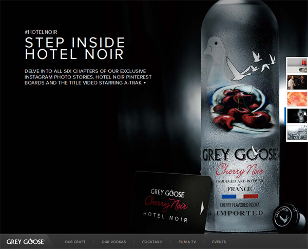
I had predicted in my Web Design Trends 2012 article that responsive design would take off last year, and did it ever! Not only has that trend grown enormously, but so have the backgrounds and images on those sites. This strategy provides the rich content that we all love (as long as the site is coded correctly and does not pre-load those large images) but doesn’t bog down mobile devices with long load times, providing users with the best of both worlds. Because of this, large responsive image design sits in my number three spot this year. (Pictured above) Grey Goose does a fantastic job of big image responsive design. Not only does it scale beautifully, it even incorporates some interesting scrolling for smooth transitions between sections of the site.
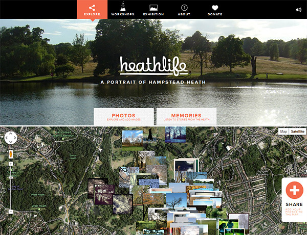
Heathlife does a really nice job with the design of their site and it is dominated by big images. It features photos of their heath that people have either posted up on the site themselves or shared on social media. The site uses Google Maps to show where the heath photos were taken.
4. Geometric Shaped Design
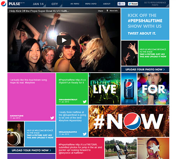
Even if Windows 8 does not catch on, I believe the design aesthetic of it will, at least for 2013. Some sites are already using the distinctive flat color blocks interspersed with image and/or video in order to stand out before others start to adopt this trend. Pepsi is one good example of this; they have also fully integrated social media into their site via HTML5.
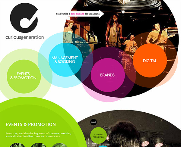
I believe this trend will branch off from solid color blocks into various other solid color shapes as seen in Curious Generation’s website, pictured above. What other shapes will appear? Only time will tell, but ideas are already running through my head and I’m sure another designer out there has similar ideas in mind.
After much research and hard work the experts here at Active Web Group have concluded that these will be the four big web design trends for 2013. Like what you see here? Why not contact us and let us show you how we can incorporate any of these new web design trends into a custom designed website for you.

