Successful website design demands keeping up with current web design trends. Implementing the latest styles and techniques will increase marketability and allow businesses to remain competitive. As business continues to pick up in 2011, take a few moments to consider what will become popular this year.
For a FREE WEBSITE DESIGN CONSULTATION, Contact Active Web Group TODAY!
The web design trends Active Web Group outlines below mark a different trend view from 2010. Contact Active Web Group to incorporate any of these new and latest design trends into your custom designed Website.
HTML5 and CSS3
You can’t talk about website design trends for 2011 without mentioning HTML5 and CSS3. As with most versions of HTML, the latest version tends to take over slowly, but eventually you’ll be hard pressed to find older styles. Both HTML5 and CSS3 make websites easier to build and link with social tools. In order to stay marketable as a designer, it is essential to understand how these systems work and use them appropriately.
There is no Flash on those websites. Flash was, and still is in a way, fruit from the forbidden tree. While almost anything could be done with Flash, design-wise, compatibility issues and interference with Search Engine Optimization still plague it. HTML5 offers some of the same design tools and functionality of Flash, without those problems, and that is why you’ll be seeing more of it in 2011.
Typography
Part of the appeal of HTML5 and CSS3 is the typography offered with them. Website design had always been somewhat limited in terms of typography. You could always use any font you wanted, as long as you rasterized it and placed it as a static image. Obviously, doing that hurts Search Engine Optimization, and also limits the functionality of that type. Typefolly.com has a nice example of what can be done with type in HTML5.
Older typography programs allowed you to use more fonts in your html, but none of them were SEO friendly. With HTML5, CSS3, and new typography programs, there are now many fonts available that do not slow down Search Engine Optimization. For example, Typekit now provides designers with options that are both attractive and SEO compatible. More print style typography will start to become mainstream in 2011 and it will even start to crop up on eCommerce sites.
Bigger and Smaller
High resolution, widescreen desktop monitors are now very affordable, and website designers will be taking advantage of that space. For many years designers had been using the Grid 960 system to optimize their design dimensions. It was based on 1024×768 pixels, which was the average monitor resolution just a few years ago. On https://www.activewebgroup.com, only 21% of visitors last month had a screen resolution narrower than 1024. Grid 1140 was created to adjust to this increase in average size. Expect to see most new grid designs for 2011 using this wider format.
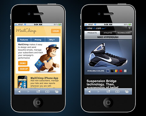
In addition to making wider sites to accommodate larger monitors, website designers will also be focusing on smaller, mobile versions of their websites. People are getting more comfortable shopping on their phones, and mobile eCommerce transactions are on the rise. eCommerce websites will increasingly have mobile versions available, either as an app, or as an alternate, small screen friendly site.
Headers
With wider designs naturally come wider headers. Since a header is the first impression a customer gets of the website, more companies will be making better use of that space. Large and interactive headers with special offers, promotions, and calls to action help increase the number of conversions a website creates. ProfessionalEquipment.com has a good example of this.
For a FREE WEBSITE DESIGN CONSULTATION, Contact Active Web Group TODAY!
Depth
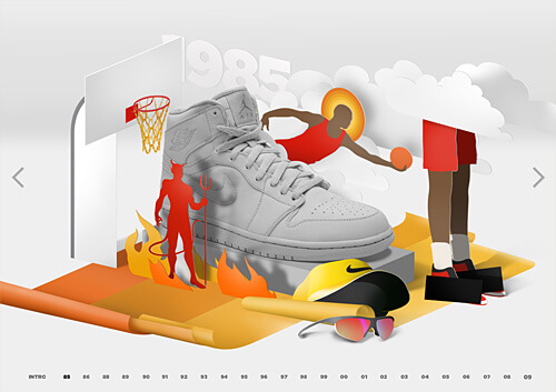
For 2011 creating a sense of dimension and depth will become more common. 3D movies and televisions started to get some traction in 2010, and web designers will be looking to capitalize on that trend for 2011. While true 3D is still just a pipe dream for web designers, the technologies currently available can be used to create a very realistic sense of depth. HTML5, JavaScript, and even Flash combine for some interesting 3D effects. Rowtothepole.com uses parallax scrolling to give their website a sense of depth, and this Michael Jordan inspired site shows a clever use of pop-up book style graphics to create a 3D effect.
Touchscreen
With smartphones, tablets, and even some desktops using touchscreens, designers need to accommodate fingertip navigation. Links that change color, or underline when a mouse is hovered over them will not have the same effect on a touchscreen. Leave plenty of space for a finger to click a link or your website will be unusable on a touch screen device.
Big Image
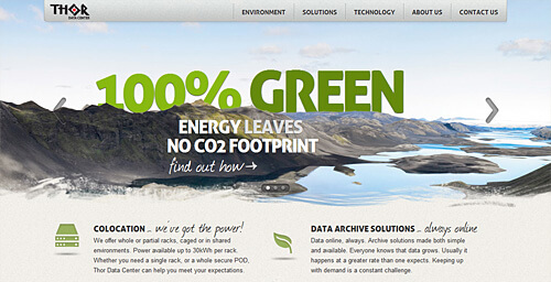
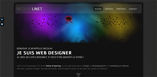
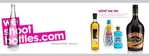
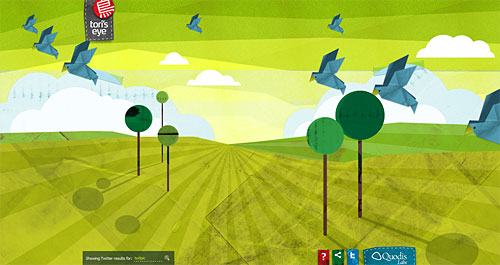
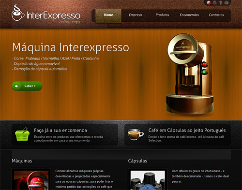
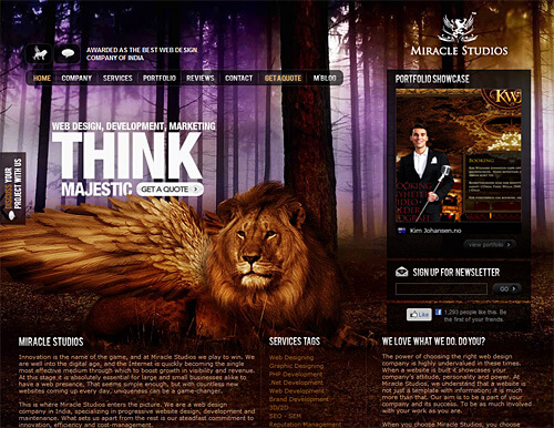
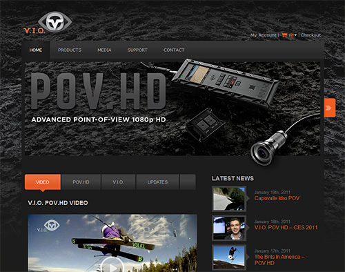
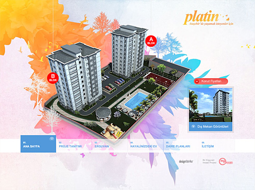
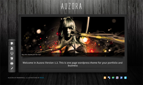
While big images aren’t new, wider screen sizes offer a bigger window with which to display them. More sites will be using that space for great big images in 2011. Here are a few examples:
Single Page
Along with touchscreens, smartphone apps, and more focus on accommodating varying screen sizes, you’ll be seeing more single page sites, with clear influences from applications and user interfaces in 2011. Interaction is key, and more user friendly websites will start to crop up.
For a FREE WEBSITE DESIGN CONSULTATION, Contact Active Web Group TODAY!
Quick Response
You’ve probably already seen these barcodes in commercials, advertising and magazines. Just take a picture with your smartphone and a website appears! These codes can be used in many ways, in many places, and over the next year will start to become a lot more common. You can use Kaywa to generate a QR code for your website!
We here at Active Web Group believe that these web design trends will be the major trends in Website design for 2011. For more information contact Active Web Group today for a free consultation or let us redesign your current Website with a custom-designed Website for your online presence.
